




Timeless or Tired? How to Keep Logos Relevant
By Jess Kaye Director at CHILLI
Kellogg’s, Pepsi, Starbucks… what do their logos have in common? They’ve mastered the tricky balance of evolving with changing trends and tastes, while holding onto their established identity.
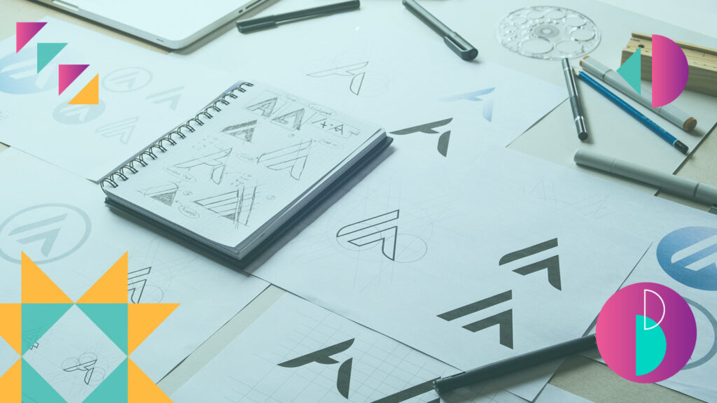
Logos are the face of a brand: the visual ID that carries weight with consumers – and as such, can completely shift how they feel about you. But people often underestimate the power of what a logo truly means.
It’s one thing for designers to make a logo look good, but the challenge goes much deeper than that – it’s creating a logo that stands out, tells the brand story and connects with consumers.
Years ago, logos mostly lived on storefronts, packaging, or letterheads. The competitive set was smaller, and standing out was easier. Today, especially in the bustling FMCG marketplace, there’s so much choice that distinctiveness is harder to achieve.
To adapt to the changing digital landscape, trends, and increased competition, many brands have flattened or simplified their logos to the point where they’ve lost their voice. So how do you evolve without erasing what makes you, you?
The four non-negotiables
A strong logo hits four key notes:
- Simplicity but not blandness. A lot of logos in the last 5–10 years have been simplified to the point of losing personality. Apple or Nike prove simplicity – when done right – can still be powerful, distinctive, and instantly recognisable.
- Memorability. ‘if someone can identify your brand after one glance, then you’re winning – (Logo board game, anyone)?
- Versatility. Your logo should work across colours, formats, contexts and platforms – whether in motion or static. If it only looks good in one place, it’s limiting.
- Timelessness. Trends come and go, but your logo needs staying power. Constantly chasing trends only makes you look uncertain and inconsistent.
The balancing act: heritage vs. hype
Here’s the million-dollar challenge: balancing your timeless brand identity with the shifting cultural and competitive landscape.
The best logos stay centred on who the brand is at its core. They evolve with subtlety rather than chasing trends that may not fit their brand or their consumer demographic.
Take Burberry. They moved from a heritage-rich logo to a stripped-back wordmark that lost its story. In the bid to modernise, they abandoned what consumers loved about them: heritage and tradition. When they reintroduced the equestrian knight, they regained authenticity and distinctiveness.
Meanwhile, brands like Guinness and Robinsons are masters of micro-change. Over decades, their logos have evolved subtly. Consumers barely notice, but the brands stay current. It’s a strategy that signals confidence and avoids alienating audiences.
And then there are brands like Absolut Vodka, which show that simplification can work if it fits the brand and its market. Their pared-down “Absolut” wordmark is strong, versatile, and instantly recognisable and not restricted to limited editions, flavours, and platforms including digital. The trick is knowing whether radical change will serve your brand, or strip it of its essence.
The lesson? Don’t try to please everyone. Know your audience, stay true to your DNA, and update with intent, not panic.
Designing for tomorrow
Looking forward, logos will face even more pressure to flex across digital platforms, formats, and screens. Versatility, simplicity, and timelessness will continue to matter, but personality and authenticity will be what separates the forgettable from the memorable.
Yes, technological advancements like AI might help speed up some aspects of the design process. But a great logo can’t just be spat out by a machine; it has to feel real. Consumers are too savvy not to notice when something lacks substance.
We’ll also see logos needing to work harder in motion. So animated, dynamic, or interactive identities that still carry the brand’s voice. Collaboration between design and brand storytelling will become even tighter, ensuring logos feel alive rather than static.
In the end, a logo must be timeless. It’s the most concentrated expression of who a brand is: past, present, and future. Get it right, and you’ll build trust, memorability, and relevance. Get it wrong, and even the most beautiful design will fail to resonate.
You May Also Like
Traditional Attribution and Promo Codes Share the Same Blind Spot
Traditional attribution and promo codes share the same blind spot.
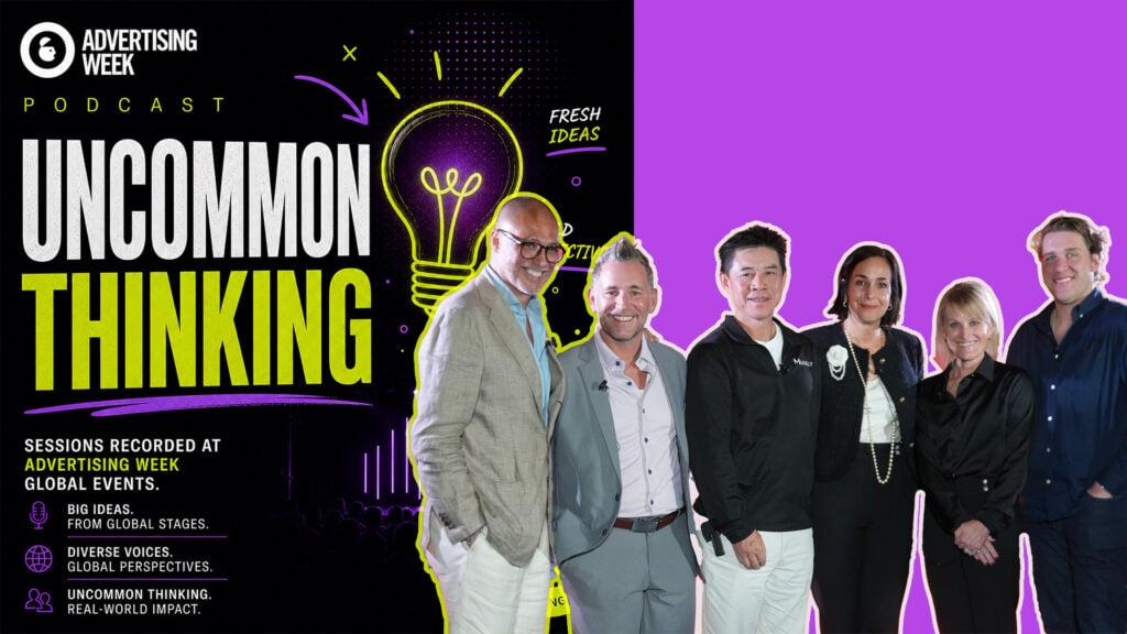
The Next Era of Financial Media Networks
On this panel presented by Citi Commerce Media, Quentin George, Distinguished Partner at McKinsey & Company, joins Jeff Chwast, General Manager of Citi Commerce Media; Jack Jia, Founder and CEO of Musely; Maryam Paez, Head of Marketing & Loyalty at Paze; Jennifer Philo, Global Vice President, Digital Commerce and Partnerships at Blackhawk Network; and Joe Groter, Vice President of Commerce Partnerships at Publicis Media to discuss what financial media networks must deliver for advertisers. The conversation examines how transaction insights, relevant offers and payment capabilities can work together to serve customers.
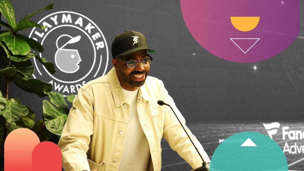
AW Playmaker Award: EA’s Troy Smith
As part of the AWPlaymaker Awards, AW360 spoke with Troy Smith, North American Athlete Marketing Lead at EA, about the evolving role of athletes as creators.