




Less Is More: In the Age of Everything, Simplicity Is King

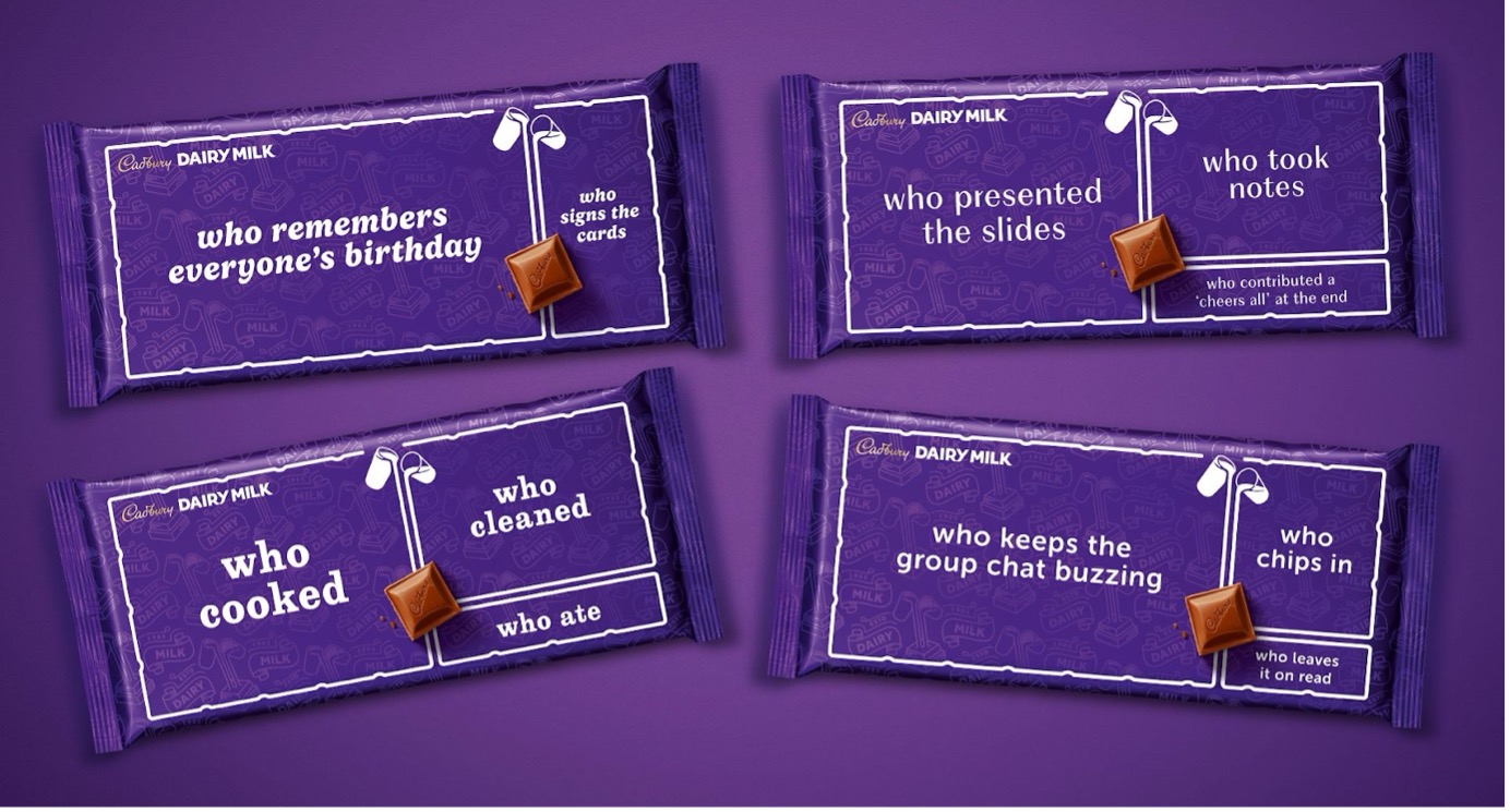
Agency: VCPP
Next, Kelloggs. They’ve cropped in on a section of their logo, so the entire ad is two words and a rooster. ‘The OG.’ Fabulous. This is, as Mark Elwood, the CCO Of Leo Burnett says, ‘true big brand behaviour. People love it. The audacity, the swagger and a chicken called Cornelius. Can you name another cornflake brand? Thought not.
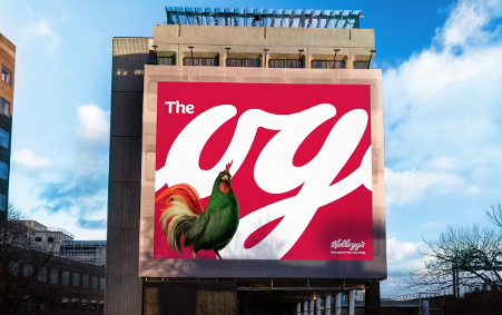
Agency: Leo Burnett
Finally, McDonalds. McD’s have done some bold OOH work with big images and a select couple of words like ‘Hack Brown’ or ‘The Rogue Dip’ that demonstrate the individual ways people enjoy their meals. There’s a beautiful long copy press ad that talks about the ‘gherkin transfer.’ Let’s hear it for the strategists. They’ve uncovered tiny truthful nuggets(!) of takeaway life – like sticking chips in milkshakes and fobbing off the bits you don’t want to someone else. Lovely.
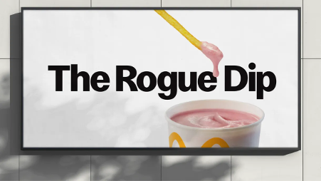
Agency: Leo Burnett
It’s interesting that these are all food brands. And they’re all advertising with a simple sophistication that belies their goods’ retail price. Perhaps they think detoxing their ads compensates for the calories in the products. Either way, it’s tasty work. So let’s keep giving the people what they want. What do the people want? LESS. Or if you’re gonna be like that, FEWER things to focus on. We want simplicity. We crave it like a chunky bar of Dairy Milk. Give us one beautiful idea that makes us think, sob or chuckle. Because, when it comes to advertising, less is, and will always be, more. Now pass the fries.
For a simple idea head to https://aml-group.com/
You May Also Like

Better Creative Can’t Fix Broken Social Media Infrastructure
Feed errors go unfixed because no one owns feeds as a strategic asset.
Winning the Human and the Algorithm, Featuring Laura Sammartino, SVP of Horizon Futures
As AI agents begin playing a bigger role in how consumers discover, compare, and ultimately choose products, retail marketers face a fundamental shift: the customer may no longer be the only audience they need to win.
The Community Gap: Lily Walla on Motherhood, Entrepreneurship, and Finding Your People
Lily Walla is a two-time entrepreneur, angel investor, and founder & CEO of Auggie, a community built to help modern parents find trusted recommendations and connect with one another.