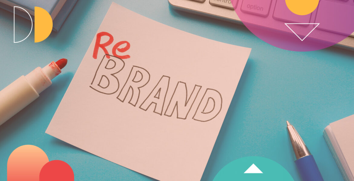
A rebrand is one of the highest-stakes decisions a company can make. Get it right and you unlock new markets, signal transformation, re-energize a brand that has outgrown its identity. Get it wrong and you erase decades of equity overnight. The difference almost always comes down to one thing: knowing what you’re changing and what you need to protect. Not all rebrands are the same. Many companies make the mistake of treating them as if they are. There are three paths most brands take with their rebrand:
Change the name. Keep the look. This is the safest move because it preserves recognition while shifting meaning. Dunkin’ Donuts became Dunkin’ in 2019. They dropped “Donuts” because 60% of revenue came from coffee. But they kept the orange and pink, the familiar typeface and the brand energy. Customers barely blinked. The brand gained room to grow beyond a single product without losing a single point of recognition.
Change the look. Keep the name. This is where companies stumble because in many cases, visual identity is how consumers physically find your brand whether on a shelf, screen or feed.
Take Tropicana. In 2009, Tropicana spent $35 million redesigning its packaging and removed the iconic orange-with-a-straw that had been the brand’s visual anchor for years. Sales dropped 20% in two months. Consumers couldn’t find the product on the shelf. Tropicana reversed the redesign within weeks. Total cost: over $50 million. The lesson is simple: visual identity isn’t decoration. It’s navigation.
Kia’s 2021 logo redesign is the same story with a different twist. The new geometric wordmark was supposed to signal modernity and an electric future. Instead, consumers read it as “KN” which generated a surge of searches for a car brand that doesn’t exist. When your new identity creates confusion about what your name is, you’ve failed at the most basic job a logo has.
Change everything — name and identity together. The boldest and most dangerous move. You’re asking customers to find you again from scratch. It works when the old brand has genuinely become a liability. It fails when it hasn’t.
The best full rebrands share one trait: the old identity was limiting the company’s future, and the new one opened territory the old one couldn’t reach.
Google’s creation of Alphabet in 2015 is the cleanest example. Google had become a sprawling conglomerate from self-driving cars, life sciences, venture capital — but the name “Google” meant search. The Alphabet restructure gave investors clarity about what was profitable and what was experimental, while preserving the Google brand for the business everyone knew. The stock has outperformed the market ever since. Alphabet recently crossed $3 trillion in valuation.
When a Rebrand Fails
Rebrand failures violate the same principle every time: they destroy existing equity without creating something more valuable in return.
Look at Twitter to X. The bird logo was one of the most recognized symbols in technology. “Twitter” had become a verb. Elon Musk replaced both with a single letter and a vague vision of an “everything app.” One year later, 49% of Americans still called the platform Twitter. Users declined. Advertisers fled. The rebrand didn’t just fail to build a new identity, it burned down the old one and left nothing in its place.
Weight Watchers to WW. In 2018, the company wanted to reposition as a wellness brand. The problem: it was still a weight-loss company. Changing the name didn’t change the business. Consumers saw through it immediately. By 2025, the company gave up and brought back the Weight Watchers name. You cannot rebrand away from what you are.
Facebook to Meta. This one is more complicated. The name change was tied to a real strategic bet the metaverse, but the bet hasn’t paid off. The stock fell over 40% in the year after the rebrand. “Meta” now carries associations with billions spent on an uncertain vision rather than the transformation Zuckerberg intended. Whether this eventually works depends on whether the metaverse does. And that’s the problem: you never want your brand identity tied to an outcome you can’t control.
Rebranding Principles
Every case, both the wins and the disasters, points to the same set of rules.
Protect what people use to find you. Visual recognition isn’t a design problem. It’s a navigation problem. If customers can’t locate your brand on a shelf, in a search, or in a feed, nothing else matters. Tropicana learned this at $50 million. Dunkin’ understood it instinctively: keep the colors, keep the energy, just drop the word holding them back.
Don’t rebrand away from reality. A new name can’t make you something you’re not. Weight Watchers was still a diet company no matter what the logo said. If the brand and the business aren’t aligned, fix the business first. The brand follows.
Open territory or don’t bother. The rebrands that create value like Alphabet, Dunkin’, Burberry each opened space the old identity couldn’t reach. Alphabet gave Google room to be more than search. Dunkin’ gave a donut shop room to be a beverage company. The rebrands that failed like X and WW created confusion without opening anything new.
Brand language is architecture, not decoration. Most companies treat rebranding as a design project. Hire an agency, get a new look. But the name, the language, and the visual system are an integrated structure. Change one without understanding its relationship to the others and the whole thing can break. Lexicon has spent four decades studying how brand language works: how names carry meaning, how sounds build associations, how a single word can open or close competitive territory. That understanding is critical during a rebrand. You’re not building from nothing. You’re rebuilding around equity that already exists, and that is harder.
Decide and commit. The best rebrands are decisive. The worst are designed by committee, tested into mediocrity, and launched with caveats. Dunkin’ didn’t agonize over whether dropping “Donuts” would confuse people. They knew the business had already changed. The name needed to catch up.
Before You Rebrand
The question isn’t “what should our new brand look like?” It’s “what is the old brand preventing us from becoming?” If the answer is specific including: we can’t enter this market, we can’t attract this audience, we can’t tell this story, then a rebrand may be the right move. If the answer is vague, example, we want to feel more modern, we need a refresh. You don’t need a rebrand. You need better marketing.
That’s the difference between Dunkin’ and Tropicana. One knew exactly what it was changing and why. The other just wanted something new.
About the Author
David Placek is the founder of Lexicon, the leading brand language consultancy. Over four decades, Lexicon has created some of the world’s most iconic brand names. The company has two leading practice areas, high technology and consumer products.