
By Karl Kangur – Founder, SEO Estonia
In this day and age, getting clicks is pretty easy, especially if you pay for them. The tough part is what happens in the three seconds after someone lands and decides whether you’re worth their time.
Paid media teams do brilliant work pulling people in, but the pages waiting for them feel like an afterthought. They’re either too cluttered and performative or hollow and weirdly silent about the things buyers actually want to know.
That costs you real money. Every click you pay for shows up as debt. It only becomes revenue when your website does the quiet work of guiding someone toward a decision.
Here, we’ll get into how that works and what to fix if your design’s quietly killing your ad spend.
Above-the-Fold Clarity That Communicates Value Instantly
Your headline, subheadline, and primary CTA all share one job. That’s to answer “What is this and why should I care?” before anyone scrolls.
Research shows that attention and engagement drop sharply past the first screen. Most visitors never make it further.
To implement this well:
- Lead with what you do, not your brand story.
- Make the CTA action-specific (“Get My Free Quote” beats “Learn More”).
- Remove anything decorative that doesn’t support the core message.
A brand that’s an example here is Bay Alarm Medical, a medical alert systems provider. They nail this approach for a high-intent, often older audience.
Their homepage immediately answers what the product is, who it’s for, and why it matters. There’s no exploration required. The value proposition is front and center, the CTA is obvious, and there’s zero ambiguity.
For paid traffic, that clarity is the difference between a conversion and a bounce.

Audience-Aware Personalization Based on Traffic Source
A visitor from a retargeting ad already knows your brand. A visitor from a cold search ad doesn’t. Sending both to the same landing page wastes one of them.
Personalization fixes that mismatch. In fact, 37% of shoppers purchase more frequently when they’re served relevant recommendations.
To implement this well:
- Match landing page messaging to the ad’s specific audience and intent.
- Use dynamic content to reflect traffic source, location, or behavior.
- Build quiz or preference flows for cold audiences who need guidance.
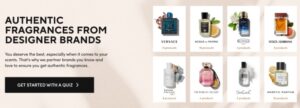
Scentbird, a monthly fragrance discovery subscription, leans heavily into personalized experiences.
Their quizzes and curated recommendation flows make new visitors feel like the brand already understands their taste.
For paid traffic, especially top-of-funnel, that immediate relevance reduces friction and gives people a reason to stay, explore, and ultimately subscribe.
Conversion-Driven Storytelling That Moves Users to Act
Facts describe a product. Stories sell it.
The brands capitalizing on paid traffic understand that people don’t buy features. They buy the version of themselves that owns the product.
Your design and copy need to build that picture fast, then close it with a clear path to purchase.
To implement this well:
- Lead with identity and outcome, not specs and materials.
- Let visuals carry the emotional weight. Copy handles the logic.
- Structure the page so desire builds progressively toward the CTA.
Icecartel, a men’s moissanite jewelry brand, turns product pages into a case for a lifestyle.
Their bold visuals, aspirational copy, and sharp product presentation work together to frame each piece around status and identity. Nothing feels accidental.
The storytelling creates genuine desire, but it’s always pointed toward a purchase decision. That’s exactly where storytelling earns its place on a commercial website.

Low-Friction UX That Reduces Cognitive Load
Every extra decision you ask a visitor to make is a small tax on their attention. Stack enough of them, and people leave.
That’s not because they weren’t interested, but because finding what they needed felt like work.
To implement this well:
- Limit primary navigation to only what drives purchase decisions.
- Use clear, descriptive labels instead of clever ones.
- Design for the path of least resistance from landing to checkout.
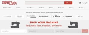
Sewing Parts Online, a retailer selling sewing machines, parts, and supplies, solves a real UX challenge: making a sprawling, technical inventory feel approachable.
Their clear categorization, functional search, and straightforward layout let customers find a specific bobbin or presser foot without digging. For paid traffic landing on a specific product type, that ease of navigation keeps the purchase momentum going.
Strategically Placed Trust Signals That De-Risk Decisions
Skepticism peaks right before a decision. For paid traffic, where visitors arrive cold with no prior relationship, that skepticism arrives early.
Trust signals reassure people and remove the hesitation that’s quietly blocking conversion. Where you place them matters as much as what they are.
To implement this well:
- Position reviews and testimonials near CTAs, not buried at the bottom.
- Display credentials, certifications, or press mentions where doubt is highest.
- Make guarantees, return policies, and support access visible before checkout.
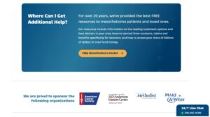
Mesothelioma.net, a resource platform supporting people affected by mesothelioma cancer, operates in one of the highest-stakes information categories online.
Their authority signals, educational depth, and 24/7 support access work together to establish credibility for an audience making deeply important decisions.
Here, conversion depends entirely on trust. Their design treats that as the primary directive, not an afterthought.
Final Thoughts
Design shapes what paid traffic becomes after the click.
Clear value, relevant experiences, simple navigation, strong storytelling, and visible trust all work together to support action.
When these elements align, brands can turn attention into measurable outcomes and improve the return on every campaign.